HegartyMaths was built to be screen size responsive. This means that the site works on tablets and mobile phones as well as desktop computers.
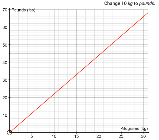
Many devices allow you to zoom in, however, this is of course dependent on the device and model. Some images, therefore, e.g. graphs, are detailed and don't show up as well on a small screen.
If this is the case, it will be best to stop and transfer to a device with a larger screen. Your progress will be saved. This should not be a problem for students who have started their homework in plenty of time. (Try not to be doing outside the classroom with 5 minutes to go!!!).

